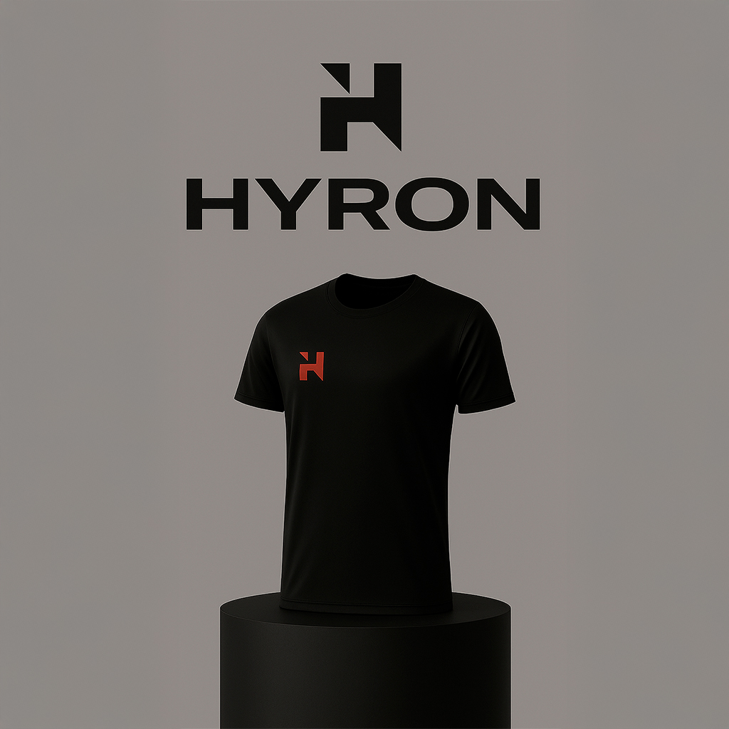
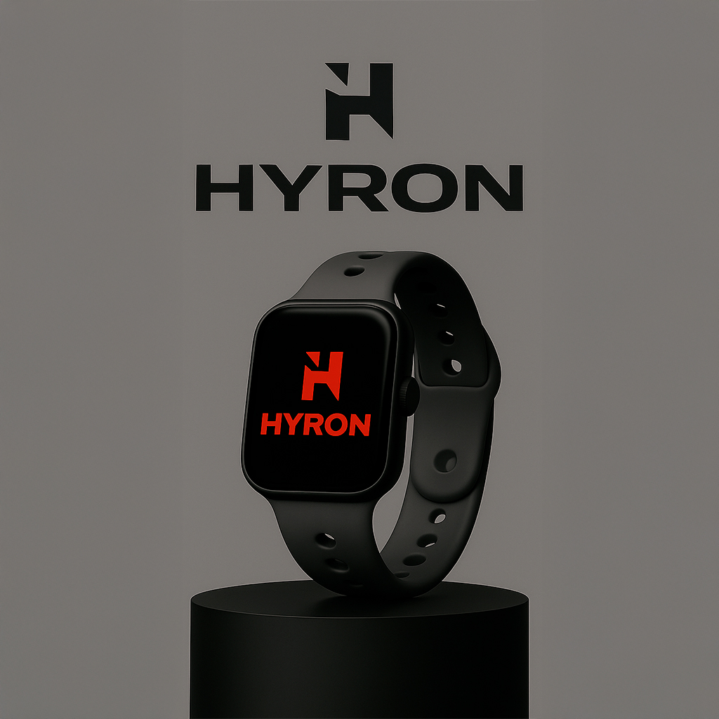
Hyron is a fitness brand that represents discipline, consistency, and unstoppable energy. Its identity is born from a clear concept: training with the strength and determination of those who always strive for their best version. Inspired by the duality between power and control, its color palette—deep gray and intense red—conveys focus, intensity, and motivation.
At Seibo, we developed its complete visual identity, including logo, imagotype, graphic system, and applications in clothing, accessories, and sports equipment. The logo combines solidity and dynamism: a stylized “H” that reflects strength, movement, and consistency.
The visual aesthetic merges contemporary minimalism with powerful energy, adapted to fitness culture without losing originality. Every element—color palette, typography, textures, and compositions—was designed to position Hyron as an aspirational, professional, high-performance brand.
Hyron is not just fitness. It is energy and discipline transformed into a lifestyle.